- Home
- Services
- IVY
- Portfolio
- Blogs
- About Us
- Contact Us
- Sun-Tue (9:00 am-7.00 pm)
- infoaploxn@gmail.com
- +91 656 786 53
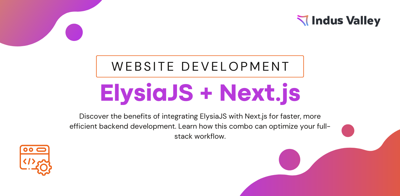
Let me be honest, early in my frontend journey, my UI code was a mess. Every new feature came with a fresh button style, inconsistent margins, and yet another way to center a div. Maintaining consistency across pages was like trying to herd cats.
Then I discovered the power of design systems, and it changed everything.
If you’re building with Next.js and struggling with inconsistent UI, this blog is for you. I’ll walk you through how I started building a scalable design system, from reusable components to style tokens, and how it brought order to the chaos.
A design system is more than a component library. It’s a single source of truth that combines:
In Next.js projects, a design system lets you ship fast without reinventing the UI with every page.
I remember a project where the app started small. But as it grew, I had buttons in 4 different colors, modals with different paddings, and 3 variations of input fields. Users didn’t notice, but I did. And it bugged me.
That’s when I decided to pause feature dev and invest in a design system.
Instead of hardcoding values like #1a73e8 or 16px, I created a tokens.ts file:
export const colors = {

  primary: "#1a73e8",

  secondary: "#fbbc05",

  text: "#202124",

  background: "#ffffff",

};


export const spacing = {

  sm: "8px",

  md: "16px",

  lg: "24px",

};


export const typography = {

  heading: "2rem",

  body: "1rem",

};
These tokens fed into my styled components or Tailwind config, so the entire app followed one visual language.
I built a shared ui folder with base components:
// components/ui/Button.tsx

export default function Button({ children, variant = "primary" }) {

  const base = "px-4 py-2 rounded font-semibold";

  const variants = {

    primary: "bg-blue-600 text-white",

    secondary: "bg-gray-200 text-black",

  };

  return <button className={`${base} ${variants[variant]}`}>{children}</button>;

}
Now, instead of styling a button from scratch every time, I just plug and play. Plus, when I updated the style of Button, it reflected across the whole app instantly. That felt like magic.
One of my best decisions? Switching to Tailwind CSS.
With Tailwind:
// tailwind.config.js

module.exports = {

  theme: {

    extend: {

      colors: {

        primary: "#1a73e8",

      },

      spacing: {

        md: "16px",

      },

    },

  },

};
Testing components in isolation was a game changer. I plugged in Storybook and used it to:
Now my Button, Input, Card, etc. all live in Storybook for quick access and testing.
I synced my tokens with Figma using tools like Style Dictionary or Tokens Studio. This made it easier to collaborate with designers. No more guessing the right blue or padding size, they’re all from the same source.
Here’s how I kept things scalable over time:
Every time I onboarded someone new, they could follow the design system and fit right in.
Later, I took it one step further, turning my UI components into a private NPM package. Now I can reuse the same design system across multiple Next.js projects with versioning and updates.
If you’re tired of inconsistent UI, weird margins, and duplicated styles, trust me, investing time into a scalable design system is 100% worth it. It made my code cleaner, my UI sharper, and development much faster.
You don’t have to go full enterprise mode. Start small: centralize tokens, build base components, and scale from there.
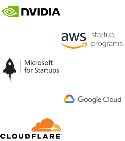
Imagine reducing your operational costs by up to $100,000 annually without compromising on the technology you rely on. Through our partnerships with leading cloud and technology providers like AWS (Amazon Web Services), Google Cloud Platform (GCP), Microsoft Azure, and Nvidia Inception, we can help you secure up to $25,000 in credits over two years (subject to approval).
These credits can cover essential server fees and offer additional perks, such as:
By leveraging these credits, you can significantly optimize your operational expenses. Whether you're a startup or a growing business, the savings from these partnerships ranging from $5,000 to $100,000 annually can make a huge difference in scaling your business efficiently.
The approval process requires company registration and meeting specific requirements, but we provide full support to guide you through every step. Start saving on your cloud infrastructure today and unlock the full potential of your business.